5 Visual Design Tips to Create an Engaging WordPress Site

Your WordPress site has seconds to make an impression, and visuals usually decide whether visitors stay or bounce.
That’s why mastering visual design tips for WordPress isn’t about making things “pretty.” It’s about guiding attention, improving readability, and keeping users engaged long enough to take action.
From layout and color choices to imagery and subtle motion, strong visuals shape how your content is consumed and remembered.
In this guide, we’ll break down practical, easy-to-apply visual design tips for WordPress sites that help your content stand out without overwhelming your audience.
Each tip focuses on clarity, consistency, and engagement, so you can create pages that look intentional, load fast, and convert better.
Essential Visual Design Tips for WordPress Success
Creating visually engaging WordPress content demands strategic implementation of design principles that guide user behavior and enhance readability. The following visual design tips for WordPress give you a handy toolkit for building an engaging user interface.
1. Use Consistent Branding Across Your WordPress Site
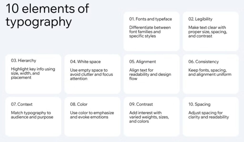
One of the most overlooked visual design tips for WordPress is keeping branding consistent everywhere. Colors, fonts, and logo placement should feel intentional, not accidental.
When pages look connected, visitors trust your site faster and navigate with less friction. Consistency also supports accessibility. Clear contrast, readable typography, and predictable layouts help all users engage comfortably.
Think of it like roadmap design. Just as companies share examples of public roadmaps to show transparency, your consistent visual framework signals reliability. When branding is scattered, engagement drops. When branding is aligned, users stay longer and interact more.
Key branding elements to standardize include:
- Primary and secondary color palette
- Logo size, spacing, and placement rules
- Typography (font) styles for headings and body text

Image via Wix
Takeaway: Consistent branding and accessible design create a trustworthy WordPress experience that strengthens recognition, boosts engagement, and builds lasting audience loyalty.
2. Incorporate Dynamic Visual Content
Adding motion is one of the more advanced visual design tips for WordPress, but it needs restraint. Videos, sliders, hover effects, and subtle animations can boost engagement when used with purpose.
Motion works best when it explains, highlights, or guides action. Too much movement, however, quickly becomes distracting. Additionally, autoplay videos can be annoying, while excessive animations slow page speed.
Use interactive elements to highlight important sections or guide users towards calls to action (CTAs). Exploring digital signage alternatives can inspire creative approaches to presenting visual content. These concepts can translate well into WordPress sections, sliders, or announcement areas.
Use dynamic visuals strategically by:
- Animating only key elements, like buttons or CTAs
- Keeping transitions short and smooth
- Testing motion on slower devices
- Applying hover effects sparingly
Takeaway: Dynamic visual content, applied with balance, energizes your WordPress site, deepens engagement, and keeps audiences returning for more interactive experiences.
3. Optimize Banners, Headers, and Hero Images for Impact
First impressions matter. Visitors decide within seconds whether to stay or leave, so your above‑the‑fold visuals must shine.
One of the most effective visual design tips for WordPress is to optimize banners, headers, and hero images. These elements set the tone, guide attention, and highlight your most important content.
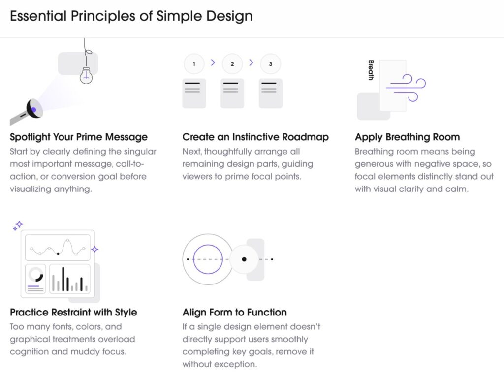
Large headings, supporting subtext, and focused imagery work together to guide the eye. Use bold typography, clear messaging, and strong imagery to create hierarchy. Also, keep clutter away — simplicity wins.

Image via Uitop
If you’re not confident in your design skills, try a professional tool. Using a banner creator to stand out can help you produce clean, polished graphics that elevate your site instantly.
To improve banner and header impact, focus on:
- One clear focal point per banner or hero section
- Strong contrast between text and background
- Consistent sizing across pages
Takeaway: Optimized banners and headers capture attention quickly, strengthen brand identity, and make your WordPress site visually engaging from the very first glance.
4. Prioritize Mobile-Friendly Visual Design
Most of your website visitors scroll on phones first. For this reason, one of the most practical visual design tips for WordPress is to prioritize mobile-friendly layouts. If visuals don’t scale well, engagement drops fast.
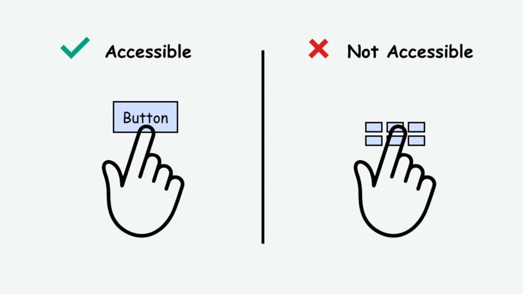
Responsive breakpoints ensure your site adapts to different screen sizes. Scalable images prevent distortion, while touch‑friendly buttons and spacing should prevent misclicks.

Image via Access Guide
Vertical flow matters more on mobile, so visuals must support smooth scrolling instead of forcing zooms or sideways movement. Always test on real devices, not just emulators, to catch hidden issues.
A site that looks great on desktop but fails on mobile loses credibility fast. To improve mobile visuals, focus on:
- Responsive WordPress themes with flexible grids
- Scalable images that load quickly without distortion
Takeaway: Mobile-first thinking is one of the most essential visual design tips for WordPress, ensuring your content stays clear, clickable, and engaging everywhere.
5. Delegate Tasks When Needed
You can’t do everything yourself, and neither should you try. Design work consumes time: resizing images, updating layouts, formatting graphics, and maintaining visual consistency across dozens of pages. These repetitive tasks drain time and focus you could spend on strategy and content creation.
Delegating these tasks helps you maintain visual consistency while scaling content faster. Fresh eyes also help. Someone focused on execution can spot spacing issues, alignment problems, or inconsistencies you might miss.
If you’re juggling content, updates, and design tweaks, it may make sense to hire a personal assistant to handle routine visual tasks. Sometimes the smartest visual design tips for WordPress involve knowing when to bring in help.
Common tasks worth delegating include:
- Formatting blog images and featured visuals
- Updating banners and page sections
- Applying design standards across new content
Takeaway: Delegating design tasks helps maintain consistency, saves time, and allows you to focus on creative growth for your WordPress site.
FAQ
1. How can visual design tips for WordPress improve my site’s SEO?
By applying visual design tips for WordPress, you create a site that’s both engaging and SEO‑friendly, boosting rankings and organic traffic. When pages load quickly and feel easy to scan, search engines see stronger engagement signals.
Visual design affects SEO more than many people realize. Optimized images load faster, and clean layouts improve readability, which increases time on page and reduces bounce rates. Mobile-friendly visuals also support Google’s mobile-first indexing.
2. What’s the biggest mistake to avoid in WordPress design?
The biggest mistake to avoid in WordPress design is doing too much at once, which leads to clutter. Overloading pages with colors, animations, and fonts confuses users. Visual design should guide attention, not compete for it.
Simplicity and consistency matter most. Following visual design tips for WordPress ensures clarity, usability, and a professional look that keeps audiences engaged instead of overwhelmed.
3. Can beginners apply visual design tips for WordPress without design tools or coding knowledge?
Yes, absolutely. Many visual design tips for WordPress rely on basic theme settings, block editors, and good spacing. You don’t need custom code or advanced tools.
Focusing on consistency, readability, and mobile-friendly layouts already delivers noticeable improvements for beginners.
4. How often should I review and update my site’s visual design?
Regular updates keep your site fresh and relevant. Aim for small tweaks quarterly and bigger redesigns every two to three years.
Applying visual design tips for WordPress during updates ensures your site stays modern, user‑friendly, and aligned with evolving digital trends.
Transform Your WordPress Site Today
Visual design shapes how users experience your content. It informs looks, but it’s also about strategy, accessibility, and trust.
By applying these visual design tips for WordPress, you create pages that feel clearer, more engaging, and easier to trust. Start small, stay consistent, and refine as your site grows.
Pick one tip today, apply it to a key page, and watch how better visuals transform engagement.


