


A moving visual can introduce a blog post, but it should not make the post harder to enter. Readers may arrive through search, open the page on a small screen or simply want to inspect the illustration before watching anything. A still-first preview gives them a stable starting point and makes motion an optional part of the story.
This is primarily an editorial workflow. Decide what the opening visual communicates, prepare its still and moving versions, and check how the chosen WordPress theme presents them. Avoid assuming that adding a video automatically creates a useful introduction or that a particular block behaves identically across themes.
Write the Preview’s Job Into the Brief
Start with the sentence the visual should help a reader understand. For an article about organising a creative workspace, that might be “This drawing introduces the arrangement of the desk, shelves and tools.” The opening image does not need to demonstrate every idea in the article.
Use an original drawing of an invented workspace for this example. Give it a clear focal point and leave enough room around that point for different display sizes. Do not put essential text inside the image when the same information can appear in the heading or caption.
State whether motion adds a useful explanation. A short highlight moving between three zones may help a reader follow the arrangement. A decorative transformation may add atmosphere but contribute little to the article’s main point. That difference should guide how prominently the moving version appears.
Prepare an Editorial Asset Sheet
Keep the original drawing, the intended caption and the moving version together. Add a short ownership note and identify the current version. The person assembling the WordPress post should not have to guess which file is approved or whether an image can be adapted.
The sheet should distinguish three elements: the still reference, the motion preview and the written explanation. Describe what stays consistent between them. In the workspace example, the desk position and the number of storage zones might be important; a gentle change in framing might be optional.
Also prepare a concise text description of the moving sequence. This gives an editor a way to judge whether the clip communicates the intended idea without requiring repeated playback.
Make the Still the Default Entry Point
Place the reference image where it can introduce the post without movement. Use the theme’s existing image and caption controls where they meet the need. Keep the opening headline and introductory paragraph readable independently of the visual.
Check the image’s proportions in the actual theme. A crop that looks balanced in a design file can hide the focal point in a narrow content area. If a single crop does not work across the required layouts, choose a simpler composition or an alternative image that remains understandable.
The still should remain useful even when the reader never watches the clip. Its caption can identify the invented workspace and state the purpose of the illustration, rather than promising a result from a real room.
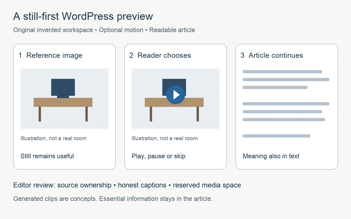
Use a still reference as the entry point. Present motion as an optional, clearly described alternative.
Choose Motion That Suits the Explanation
For an exact sequence, authored animation lets the creator control the order and position of each highlight. The desk, shelves and tool area can remain unchanged while attention moves between them. This is useful when the article depends on those precise relationships.
A generated interpretation is another option when the visual is intended as a concept. A creator could use Magic Hour’s image-to-video tool to explore an original workspace drawing. Review the resulting clip against the source before deciding whether it belongs in the post.
If a fictional or authorised presenter is included as part of the concept, lip sync AI can be considered for aligning an approved generated performance with the intended presentation. Keep the presenter clearly fictional or authorised, and do not present generated speech as recorded real speech.
Look for changed objects, invented lettering or movement that suggests a different story. If the clip alters the arrangement being explained, use the still or a controlled sequence instead. An attractive interpretation should not quietly replace the article’s reference image with conflicting information.
Offer a Deliberate Playback Choice
Present the moving version with a clear description and a reader-controlled way to watch it. Do not rely on autoplay to communicate essential information. A reader should be able to pause, stop or skip the clip and continue through the article.
For a generated preview, place a caption such as “Generated motion concept based on an original illustration; not recorded footage” beside the player. If the clip was prepared with an AI video generator, the caption and surrounding copy should still make clear that the visual is a generated concept rather than recorded footage. If the clip contains meaningful audio, include the relevant information in text as well.
Use the controls available in the chosen block or media player, then inspect their actual behaviour. Settings, controls and presentation can vary with the theme, plugins and hosting setup. A workflow should describe what needs verification without promising that a particular interface guarantees it.
Give the editor a clear decision rule: publish the still if the moving version does not add a useful explanation. There is no need to delay a helpful article while searching for a decorative effect. Keep any unfinished motion study outside the publication assets so it cannot be mistaken for the approved preview during a later update.
Review the Layout Before Publication
Preview the post at the intended screen sizes. Check that the image and player fit the content area, captions remain readable and nearby text does not jump unexpectedly as media appears. If the layout shifts, review how the media space is reserved in the existing theme or block configuration.
Keep the motion version out of the way of reading. It should not cover navigation, interrupt a paragraph or require the reader to interact before reaching the article. Check keyboard access to the player and confirm that the still alternative remains easy to find.
Finally, review the post after publication. Compare its title, captions and visual sequence with the approved asset sheet. A still-first preview succeeds when the article remains clear on its own and the optional motion adds a well-labelled interpretation rather than an obstacle.
About the contributor: Magic Hour creates tools for making and editing visual content. This original article was prepared with AI assistance and submitted for the publisher’s editorial review.


