


How To Use Padding And Margins In Responsive Email Designs?

Padding and margins are crucial spacing techniques in responsive email design. They might seem similar at first, but understanding their distinct roles is key to having confidence in your email layouts, regardless of the device or email client.
In a responsive email template design, an element’s margin represents the element’s outside space, while the padding represents the inner space surrounding the element. Margins keep elements from bumping into each other, while padding provides breathing room for your content. Combined, padding and margin can elevate your email design, giving it a polished and professional appearance.
Understanding how these components combine to separate text and graphics is important. Nail it, and your email design will look professional and visually appealing. Miss the mark, and you could end up with a visual disaster.
If you’re interested in learning more about what padding and margins are and how to use them in responsive email templates, this guide will cover everything you need to know.
The CSS Box Model
You first need to understand the CSS box model to get a handle on margins and padding. It’s a fundamental concept in design that dictates how elements are structured and rendered on a page. The CSS box model breaks down each HTML element into a layered box composed of four components:
- Content: The core of your element, where your text or images live.
- Padding: It defines the space between an element’s content and its border. Padding gives your content some breathing room.
- Border: The outline surrounding the padding (if any). Borders can be styled to add visual flair.
- Margin: The outermost space, separating your element from others or the container’s edge. Margins keep your element from feeling cramped.
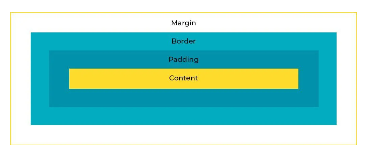
Image Source: Email Uplers
What is the Margin in Responsive Email Template Design?
In CSS, A margin is the space outside the border of an element. It defines the distance between the element and its surrounding elements or the edge of the email container. Margins create separation between different sections or elements within an email, ensuring that content doesn’t appear cramped or cluttered.
Why Margins Matter in Email Design
Margins are more than just a design detail—they’re crucial for maintaining a clean and organized look in your emails. Given the variety of devices and email clients your emails might be viewed on, margins help ensure your layout remains consistent and visually appealing no matter where it’s seen.
They keep your content from bumping into each other, making your email not only easier to read but also more engaging.
Units of Measurement of Margins in CSS
Margins can be adjusted using various units, each with its strengths:
- Pixels (px): For precise control over spacing. For instance, margin: 20px; gives you a 20-pixel margin on all sides.
- Percentages (%): Useful for responsive designs, as margins are calculated relative to the containing element’s width. For example, margin: 5%; sets a margin that’s 5% of the container’s width.
- Em: Relative to the font size of the element. Great for proportional spacing that adapts to text size. For instance, margin: 2em; means the margin is twice the font size.
- Auto: Lets the browser handle the margins, often used to center elements horizontally. For example, margin: 0 auto; centers an element within its container.
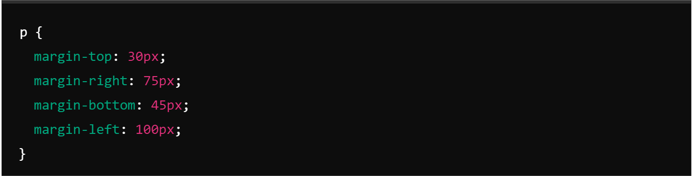
How to Add Margins in CSS
You can define margins individually or use the shorthand margin property to set all margins at once:
- Individual Margins:
margin-top: Sets the top margin.
margin-right: Sets the right margin.
margin-bottom: Sets the bottom margin.
margin-left: Sets the left margin.
For example:
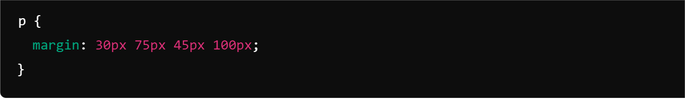
- Shorthand Property:
The shorthand margin property allows you to set all four margins in one declaration. Values are applied in a clockwise direction, beginning at the top.
For example:
Challenges with Margins in Email Design
A common challenge in working with margins is margin collapsing. This occurs when margins of adjacent elements (like a heading with a bottom margin followed by a paragraph with a top margin) combine into a single, larger margin.
Here are two common solutions to prevent margin collapsing:
- Block Formatting Context (BFC): This establishes a formatting context for the element, preventing margins from collapsing with surrounding elements.
- Flex and Grid Containers: These container types automatically create formatting contexts for their content, effectively stopping collapsing.
What Is Padding in Responsive Email Template Design?
Padding is the internal space surrounding an element’s content. Think of it as the cozy cushion inside a package, giving your text, images, and other content some much-needed breathing room. This space isn’t just about aesthetics—though it helps your email look sharp—it’s also about functionality and readability.
Units of Measurement of Padding in CSS
Padding can be defined in various units:
- Pixels (px): Offers precise, fixed spacing. For example, padding: 15px; ensures a consistent 15-pixel padding.
- Percentages (%): Creates padding relative to the element’s width, great for responsive designs. For example, padding: 5%;adapts to different screen sizes.
- Em: Sets padding based on the element’s font size, promoting proportional spacing. For instance, padding: 1em; adjusts with the font size.
Adding Padding in CSS for Emails
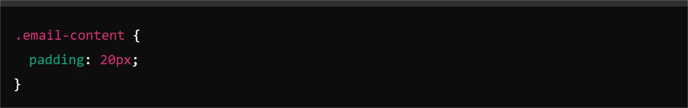
In CSS, padding is like the extra room you give your content inside its container. Here’s how to use it:
- Basic Padding Syntax: To add padding, use the padding property. For example:
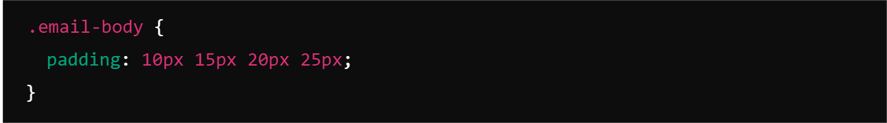
- Custom Padding Values: You can specify padding for individual sides using up to four values:
- Two Values: Sets padding for top/bottom and left/right.
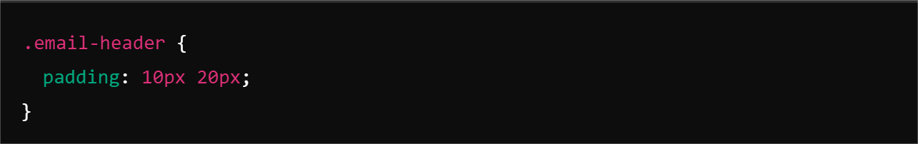
- Three Values: Sets padding for top, left/right, and bottom.
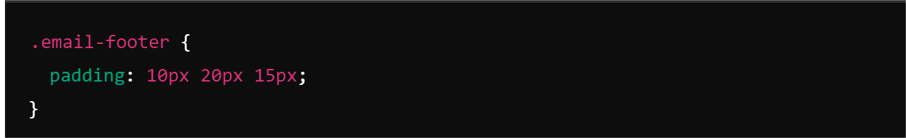
- Four Values: Sets padding for top, right, bottom, and left, respectively.
Challenges with Padding in Email Design
While padding is a valuable tool, it’s essential to be aware of the challenges posed by different email clients:
Inconsistent support: Some email clients may not render padding as expected, leading to variations in your email’s appearance.
Outlook issues: Outlook, especially older versions, can be particularly problematic with padding. To achieve consistent results, alternative methods like table-based layouts or inline styles are often necessary.
To overcome these challenges, consider combining padding, table-based layouts, and inline styles to create a robust and adaptable email design. Always test your emails across multiple email clients to ensure optimal display. While testing this, consider also using a DMARC report analyzer to ensure that your emails are being delivered to the right inboxes and not being flagged as spam.
Margin vs. Padding
- Inside vs. Outside
Think of the margin as the breathing room around the outside of your email elements, creating space between your content and its container or other elements. Padding, on the other hand, works from the inside, providing space between the content and the border of its container.
- Background vs. Transparency
Margins are transparent, so you’ll see whatever’s behind your element. Padding, however, is part of the element’s own background—whether it’s a color or image—so it affects how the content sits within its container.
- Impact on Size
Margins affect the overall layout by pushing elements away from each other and altering their position within the email. Padding increases the space inside the element, which can make the content area appear larger without changing the actual size of the element (unless you’re using the box-sizing property).
- Negative Values
Margins can be set to negative values to create overlapping effects and unique layouts. Unfortunately, padding doesn’t support negative values; it’s strictly for adding space.
- Other Element Styling
Margin is not influenced by the styling of other elements, making it a straightforward way to create spacing around elements without affecting their appearance. Padding can inherit the styling from other elements, which means that if you’re using a background color or image on the element, the padding will affect how this styling is displayed around the content.
- Impact
Margins impact adjacent elements, potentially causing them to shift or adjust their position based on the margin values applied. Padding affects only the content within the element itself and does not influence other elements on the page. This makes it an excellent tool for managing the internal layout and ensuring content is well-spaced and visually appealing.
When to Use Margins
Need to tweak the position of your elements? Margins are your best friends here! For example, if you want a button to pop up right in the center of your email or align it neatly to the right, margins make it a breeze.
Want to make your email design stand out? Try using margins to create some stylish overlaps. Imagine you have an image that you want to partially cover a text block or a call-to-action button that overlaps with a banner. Negative margins are your best bet for pulling off these eye-catching effects, adding flair, and drawing attention to key content.
Margins help you maintain the right amount of space between elements. Say you’ve got a series of product images and descriptions. By applying consistent margins between them, you avoid a cluttered look and make your email easier to read.
When to Use Padding
Padding is your go-to for making your email buttons more inviting or giving images more breathing room. Say you want a call-to-action button to be more prominent and easier to click. Adding padding around it will make it larger without affecting its outer size. Similarly, extra padding around images ensures they don’t feel cramped and maintains a clean look.
Padding is perfect for creating a comfortable distance between your content and the edges of an element. Imagine a text block with a border around it—padding adds space, so your text doesn’t feel squeezed against the border.
Adding padding around a paragraph or a product description ensures the text is well-spaced and easy to read, improving the overall user experience and readability.
Wrapping Up
And there you have it! Understanding the roles of padding and margins is essential for creating clean and effective layouts in responsive email template designs.
Effective use of padding and margin enhances email aesthetics and performance across different platforms. With well-placed margins and padding, your designs will be cleaner, more engaging, and easier for your audience to navigate.
So, the next time you’re crafting an email template, remember to use margins and padding strategically to create a polished, professional look that stands out in any inbox.


