Tips for Creating an Irresistible Color Palette for Your Website

You’ll find colors on whatever website you look at these days. Color is a vital component of any website, and most website color schemes do an excellent job incorporating them naturally.
It’s the silent storyteller of web design, captivating visitors and setting the mood for their online journey. It can entice, evoke emotions, and leave a lasting impression. Imagine a website without any color palette – blank or grey. It seems dull and doesn’t “click” in any way with the visitor.
A thoughtfully crafted color palette can elevate the aesthetics of your website, evoke specific emotions and enhance the overall user experience – which you need in any case and any website.
- It’s All About Color Psychology in Web Design
- Exploring What Different Colors Mean
- A Color Palette Provides Brand Coherency
- 10 Tips for Creating an Irresistible Color Palette for Your Website
Creating an irresistible color palette is not a mere artistic indulgence but a strategic decision to make or break your website’s success. You don’t have to be an expert on web design – you just need to see and think outside the box, sometimes.
It’s about selecting colors that resonate with your brand and target audience. It’s about aligning with the principles of what’s known as color psychology.
So, let’s embark on this colorful journey with tips for creating an irresistible color palette for your website.
It’s All About Color Psychology in Web Design
Before diving into the tips, here’s a quick word about the psychology of colors! In the web design world, color holds tremendous power. Color psychology, the study of how colors impact human behavior and emotions, plays a crucial role in web design.
By understanding color psychology, you can harness its potential to create a captivating and engaging website.
Exploring What Different Colors Mean
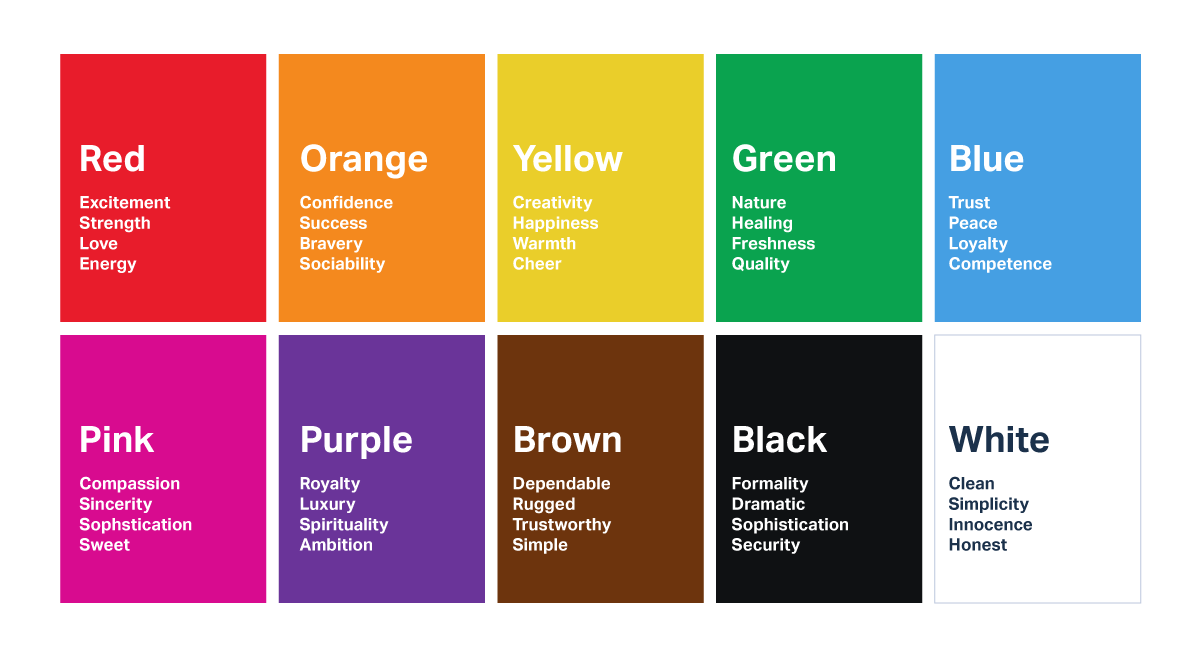
Colors have inherent meanings and associations that vary across cultures and people. Let’s see some common emotions associated with different colors:
Warm Colors:
- Red: Often associated with passion, energy, and excitement
- Orange: Symbolizes enthusiasm, creativity, and warmth
- Yellow: This evokes feelings of happiness, optimism, and of course, warmth
Cool Colors:
- Blue: Associated with tranquillity, trust, and reliability
- Green: Symbolizes growth, harmony, and nature
- Purple: Evokes a sense of luxury, creativity, and spirituality
Neutral Colors:
- Gray: Often associated with balance, professionalism, and neutrality
- Brown: Symbolizes earthiness, stability, and reliability
- Beige: Evokes a sense of simplicity, calmness, and approachability

A Color Palette Provides Brand Coherency
The most important aspect of your business is its aesthetics. This creates brand consistency and coherency in all your marketing material across the internet. Two are the most important things that a color palette accomplishes.
- Branding: Colors can communicate brand identity effectively. For example, vibrant and bold colors might suit a youthful and energetic brand, while muted and sophisticated colors may align with a more luxurious brand. With a logo generator, businesses can ensure consistency in branding across various digital and print platforms.
- Target Audience: Different colors resonate with different demographics. Consider your target audience’s preferences and cultural associations when selecting your color palette. For instance, a website targeting children may incorporate bright and playful colors, while a website targeting a professional audience may opt for more subdued and sophisticated tones.
10 Tips for Creating an Irresistible Color Palette for Your Website
This is the list you’ve been waiting for. This section discusses the ten essential tips for creating a website color palette to make your visual elements stand out and your visitors return to your website. Here’s the list.
Understand your brand identity.
- Reflect on your brand’s personality, values, and target audience.
- Identify the emotions and messages you want to convey through your website’s color palette.
- Ensure that the colors you choose to align with your brand’s overall identity and resonate with your target audience.
Consider color psychology.
- Explore the emotions, associations, and cultural meanings associated with different colors. These principles evoke specific emotions and create a desired atmosphere on your website.
- Remember that color preferences and interpretations vary across different demographics and cultures.
Start with a primary color.
- Begin by selecting one or two primary colors representing your brand and conveying the desired message.
- Choose a color that can be a base for your entire color palette and be used prominently throughout your website.
Build a harmonious website color scheme.
- Choose a color scheme that complements your primary color(s).
- Experiment with website color schemes like monochromatic, complementary, analogous, or triadic.
- Ensure that the colors in your palette blend well together and create a visually pleasing balance.
Create contrast and hierarchy.
- Use contrast strategically to highlight important elements and create a visual hierarchy.
- Pair light and dark colors to enhance readability and draw attention to key content.
- Utilize contrasting colors for call-to-action buttons or important sections to make them stand out.
Consider accessibility.
- Ensure your color palette meets accessibility standards, providing sufficient color contrast for users with visual impairments. In many cases, especially when you build with WordPress, you can easily create a dark mode or a different shade of the website with plugins.
- Use online tools and resources to test color contrast ratios and ensure user readability.
Limit the number of colors.
- Avoid using too many colors in your palette, as it can overwhelm the visual experience.
- Stick to a limited number of colors (typically 3-5) to maintain consistency and coherence throughout your website.
Experiment with shades and tones.
- Play with different shades and tones of your chosen colors to add depth and variety to your palette. An exceptional demo is Google’s Art Palette, where they analyzed the colors from many works of art worldwide.
- Lighter and darker variations of your colors can be used for backgrounds, text, and accents, creating visual interest. You can even split your content with different shades for backgrounds or add images that complement them.
Test and gather feedback.
- Implement your color palette on a test website or staging environment, like the one on HostPapa’s shared hosting plans.
- Gather feedback from users, colleagues, or focus groups to gauge the impact and effectiveness of your color choices. Do a social media poll even!
- Make adjustments and refinements based on feedback to improve the overall experience.
Stay updated with design trends.
- Keep an eye on current web design trends, especially color trends.
- Incorporate modern and relevant color choices to ensure your website feels fresh and up-to-date.
- Balance trendy colors with timeless elements to maintain a timeless appeal.
Conclusion: It’s Easier Than You Think!
Creating an irresistible color palette isn’t something new. Everyone tries to pursue this exact goal for their websites too. But some tend not to bother at all!
Your new website is not just a matter of aesthetics; it’s a strategic decision that can significantly impact your online success. It’s not as simple as choosing the best web hosting plan, but ensuring the color palette speaks to your visitors is crucial.
By carefully selecting colors that align with your brand, target audience, and principles of color psychology, you can create a visually beautiful and engaging website that makes your visitors simply come back!
Color plays a vital role in shaping user experience and engagement on your website, but that doesn’t mean you should shift your focus away from the content. Website copywriting and website intent is still the most important aspect of any website.
A simple blog might have more pastel colors that are more calming, allowing your visitors to take a breath while going through your text. A news outlet can have a bold feature color and aesthetic, meaning it needs to grab your attention from the moment it loads up on your device.
Another thing is that designing a color palette for your website is an exciting and creative process. Whether you do it alone or work with a web design Dubai agency you can ensure that your chosen colors align with your brand identity, enhance user experience, and create a visually appealing website that captures your audience’s attention. Even if you’re not a web designer, this can be easily done if you side with a solid website builder application.
But what’s even better is that if you have a vision, HostPapa can help. Thanks to the Do-It-For-Me plan, specialists can bring it to life and create something spectacular from scratch without you lifting a finger.
In conclusion, crafting an irresistible color palette balances three major things: art, psychology, and strategy. It doesn’t have to be a tiresome process, and thanks to the plenty of helpful services and resources online, you can do it almost effortlessly. So, paint your digital canvas with colors that leave a lasting impression!
This is a guest article contributed by Loukas Kouvelis.
Loukas is a technology enthusiast and a content producer for HostPapa’s blog. He enjoys writing content for a crazy amount of topics, and he is a music fan who loves playing the guitar and occasionally shooting photos and videos professionally for his own tech website – more on LinkedIn.


