


Key Design Principles To Maximize Your Website’s Potential

This piece will focus on the design & UX-side of running a digital business, especially on creative platforms like WordPress. We’ll explore foundational design principles that have been tried and tested over generations, specifically how they could translate to modern websites.
In a hyper-digital era where everything and everyone is online, brands need stellar websites to stand out and capture value from their audience. This calls for great design, a culmination of factors that together create a beautiful, intuitive user experience. The problem is: That isn’t easy. Most business owners are so focused on actually running their business, there are very few resources left to allocate towards web optimization.
We’re here to make it easy, delivering a carefully curated selection of design principles that you can leverage to maximize your site’s potential. From theory to application, we’ll walk through each principle on various levels to better understand how it translates to modern web design — let’s jump right in.
Find Your Aesthetic
Your brand needs to be memorable to stand out, so defining your brand’s aesthetic is key to differentiating. Just look back at some of history’s biggest brands — Apple, Nike, Coke — and notice that they all had something visually unique about them. An original essence or stylistic quality that echoed their brand, no matter where you saw it. To create that for yourself, we’ll approach aesthetics from two key design principles: Color theory and typography, both of which can be powerful tools in crafting your brand’s web persona.
Color Theory
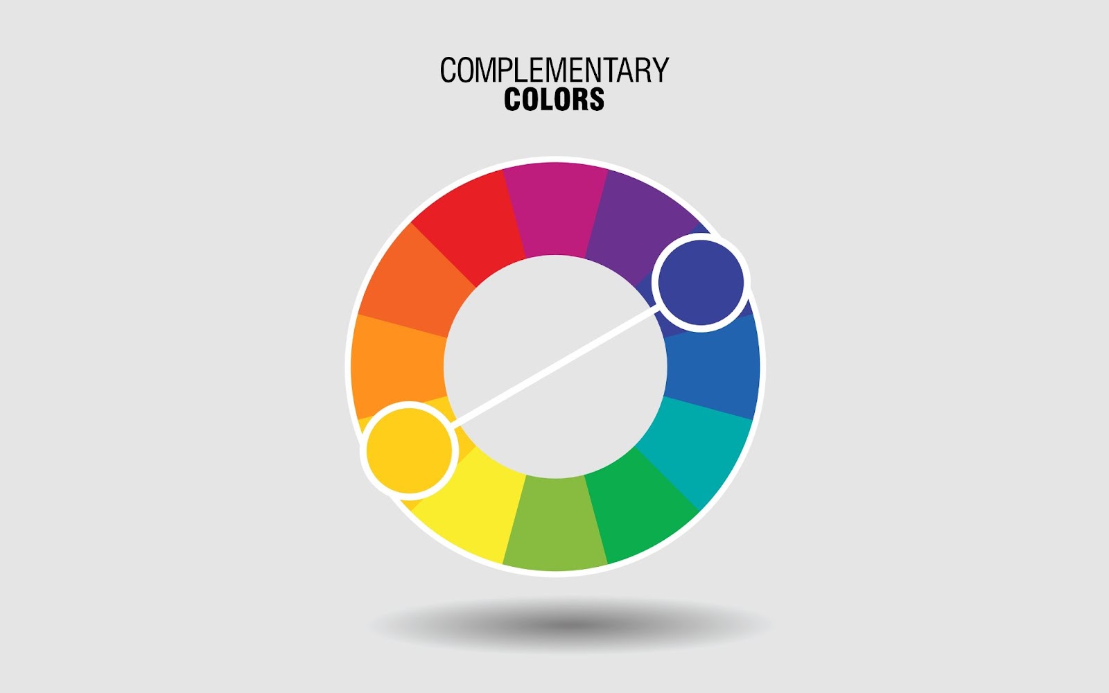
Colors play a massive role in driving consumer behavior — both consciously and subconsciously. Certain shades are known to invoke certain emotions, and brands that use killer color combinations are remembered in the minds of their consumers forever (ex., Google’s multicolored webpage.)
To leverage color theory effectively on your website, start by selecting one or two primary colors; these will serve as a foundation for your brand. Make sure they’re strong shades that represent your brand well since they’ll consistently be used throughout your site.
Now, we will find two more shades to complement our primary colors — but not as strong this time. Instead, opt for neutral colors such as grey, off-white, or beige to ensure you do not draw away from the primary color’s impact & presence. This strategy has worked wonders for many brands in the past, but most notably Coca-Cola in their trademark red & white branding.
Typography
Typography is another powerful element of design, shaping your brand’s visual identity. In fact, Apple co-founder Steve Jobs famously obsessed over typography, asserting it was “beautiful… in a way science can’t capture,” adding that typography was responsible for the Mac’s great typeface. It’s clear that elegant fonts go hand-in-hand with great web design, which is why you should be deliberate in choosing your own site’s typography.
When picking fonts for the web, always remember it’s a tradeoff between personality and legibility. Start by selecting one or two font families for smaller text; Serif and Sans Serif are both popular collections with a myriad of options to choose from. For headlines and more prominent text, pick something eye-catching that aligns with your brand. In the end, it’ll be these few fonts that comprise the whole of your brand’s typography — so choose wisely!
Simplicity is King
The next core pillar of design we’ll leverage is simplicity, an essential trait in any successful website. Online traffic is notoriously slippery, which means visitors leave quickly unless they see the value. A cluttered site with information overload sucks for this — it cripples your digital odds of success. However, a clean and simple design minimizes friction for your users, which is why we’re going to explore how to achieve that using minimalism and spacing.
Minimalism
Everyone loves minimalism – and for good reason. It brings clarity by stripping everything away down to the core elements, preserving only what is necessary and valuable to a system. Minimalistic design can drastically improve your website’s bounce rate and engagement by adding direct experiential value to every visitor’s experience.
Translated to the web, this means ruthlessly eliminating anything that doesn’t add to your audience’s experience. Remove fancy animations, large imagery, and excess buttons to maximize your minimalism and amplify the core message of each page on your site. With copywriting, filter down to purify your language. Use concise wording that gets straight to the point, skipping all the fluff.
By doing this, you let your site “breathe,” drawing attention back to the main message.
Spacing
Another age-old principle of design is spacing, a reliable way to bring about simplicity in any visual system. Great spacing can revitalize a static website by strategically placing elements in ways that maximize their collective value.
To start, understand the power of whitespace. It’s where you put nothing at all, and yet can still be super impactful in creating visual space for other elements to dominate. Make sure you leave plenty of whitespace beside and above key items on your site, such as headings and CTAs.
Maintaining Balance
The final lens we’ll peer through to optimize your web design is balance. It ties everything together. From your visual identity to brand aesthetics and typography: Everything is refined once you implement a sense of balance throughout your web presence. To accomplish this, we’ll leverage two facets, proportion and scale, and understand exactly how they can help maintain balance on your site.
Proportion
Here, all things are relative. Or, that’s at least what design theory says about proportion — but how can it lead to balance? Mastering proportion is the art of finding visual harmony with your elements, which in turn brings about balance.
Start by understanding the purpose of each element on your website; some might be hero text, CTA buttons, subheadings, etc. Identify how important each piece is to the end goal of your website. This will serve as a guide for how you should size each element! Make items with the same purpose the same size, and make focal items larger to play on proportions.
Scale
Finally, let’s talk about scale and how this principle of design can invoke balance on your website. This is essentially an extension of proportion, except taken to the extreme. It’s when you place something tiny right beside something huge just to heighten the contrast. However, we’ll use scale to create balance and maximize the value of your website content.
If you use scale effectively, you can guide the user’s attention throughout the page. Their eyes naturally move from larger content towards smaller ones, so utilize that to tell a story along the way. This is sometimes known as the process of establishing a hierarchy of a webpage.
Wrapping Up
Design has been the foundation of great things forever, and that continues in the digital age of websites. Brands must establish a strong visual persona throughout their online presence to stand out and differentiate themselves amongst saturated competitors. Cut through the noise by leveraging these design principles in your digital presence, and start capturing more value now!


