How to Create a Sticky Menu & Header With Elementor

Many of our readers often ask us, “How to Create a Sticky Menu & Header With the Elementor.” To address this query, we thought of why don’t we write an article explaining the entire process of how to create a sticky menu & header with Elementor. With that thought, we are creating a summary of how you can create a sticky menu & header with Elementor.
For starters, Elementor is a tool within WordPress. It is one of the most famous and easy to use page builders that helps you to create and design WordPress websites with ease. You can be fully creative when it comes to using Elementor as a tool to customize your website. Sticky header and menu refer to the feature within a website. While you are navigating through the website from a mobile device or a PC, you start the scroll while the header rests at the top of the page. However, as you start to scroll down, the header shrinks down and sticks to the top of the page in a slightly different format.
The awesomeness of this feature is that it makes your website look super cool. As you can be creative with how the header looks as the visitor starts scrolling on your website it gives a lot of new avenues to explore. This feature can be considered as a unique addition to your website. In this write-up, we will show the step by step guide on how you can create a sticky menu & header with Elementor.
Before that, we are assuming you are familiar with WordPress and Elementor. You have a functioning WordPress website already which is compatible with Elementor. Plus we are also assuming you have some basic items and logo already inserted in the header menu. Now as we have set the scene, we will go into the details of how you can create Elementor sticky headers with Elementor easily.
Step by Step Guide to Creating Shrinking Header with Elementor
If you have set your regular header on your WordPress theme, we will look into the details of how to make this Elementor sticky header shrink. To have a functioning shrinking Elementor sticky header, you will have to tweak the custom CSS of your website. Don’t worry, we have got your back as we will reveal the exact code you need to have this sticky header effect for Elementor.
Step 1: Edit Header Template in Elementor
The very first step is to edit your header with the Elementor theme builder. Please take the following steps:
- Log in to your WordPress admin dashboard.
- From the menu at the left-hand side go to “Templates” >> “Theme Builder”.
- Click on the “Edit with Elementor” option to get started with editing your Elementor header.
Step 2: Get Your CSS on Track
In this step, you will need to take care of some basic housekeeping of your CSS settings. The basic housekeeping will ensure your header will work with the CSS code that you will put in the following step. Please follow the mentioned steps:
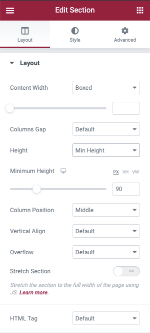
- Open the settings from the Header section
- From the Layout tab, ensure the HTML Tag drop-down is selected as the header

- Navigate to the Layout tab.
- Ensure the Minimum Height of the header is 90px. The size can be changed later, but for easier understanding start with 90px.

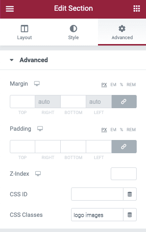
- Move on to the Advanced tab and select sticky-header for the Header Section.

- Next, you will have to open the image widget containing your logo and navigate to the Advanced tab.
- In that section, set Image’s CSS Classes field to logo images.

Step 3: Set Motion Effects to Create Elementor Sticky Header
To activate the Elementor sticky header, you can make use of Elementor’s Motion Effects feature. To do that, take the following steps:

- Open settings of the header section.
- Navigate to the Advanced tab.
- Open the Motion Effects Settings.
- Set the Sticky drop-down to Top.
- Ensure the Sticky On Box includes Desktop only. Other devices need to be deleted,
- The Effects Offset should be set to 90.
4. Step 4: Add Custom CSS:
As we are done with the housekeeping, now we can move into the details and add the custom CSS code to the website. We will show both basic and advanced ways of getting sticky header effects for Elementor free. In case you are using Elementor 2.9 and above, you can utilize the Global Style Rules to add this CSS.
In order to add the custom CSS, follow the steps below:
- Click on the hamburger menu icon located at the top-left corner of the Elementor menu.
- Navigate to Choose Theme Styles below the Global Style section.
- From that section, pick Select Custom CSS (the color will change to blue from its previous genetic red color).
- Then add the following CSS code.
header.sticky-header {
    --header-height: 90px;
    --opacity: 0.90;
    --shrink-me: 0.80;
    --sticky-background-color: #0e41e5;
    --transition: .3s ease-in-out;

    transition: background-color var(--transition),
                background-image var(--transition),
                backdrop-filter var(--transition),
                opacity var(--transition);
}
header.sticky-header.elementor-sticky--effects {
    background-color: var(--sticky-background-color) !important;
    background-image: none !important;
    opacity: var(--opacity) !important;
    -webkit-backdrop-filter: blur(10px);
    backdrop-filter: blur(10px);
}
header.sticky-header > .elementor-container {
    transition: min-height var(--transition);
}
header.sticky-header.elementor-sticky--effects > .elementor-container {
    min-height: calc(var(--header-height) * var(--shrink-me))!important;
    height: calc(var(--header-height) * var(--shrink-me));
}
header.sticky-header .elementor-nav-menu .elementor-item {
    transition: padding var(--transition);
}
header.sticky-header.elementor-sticky--effects .elementor-nav-menu .elementor-item {
    padding-bottom: 10px!important;
    padding-top: 10px!important;
}
header.sticky-header > .elementor-container .logo img {
    transition: max-width var(--transition);
}
header.sticky-header.elementor-sticky--effects .logo img {
    max-width: calc(100% * var(--shrink-me));
}

If your Elementor is not 2.9 version, you will have to get access to the settings of the header section, navigate to Advanced >> Custom CSS.
Step 5: Customize the CSS
The above mentioned steps will help you to create a shrinking sticky header on Elementor. If you want to know more details on how to customize the header even more, you can have a look at the CSS code given below to be more creative with the header. You can change many variables of the header and customize the Elementor sticky header as per your requirement. In order to put this CSS edit directly in the Elementor, we will suggest using a code editor. You can use Visual Studio Code or Atom that will help you to put the code easily and benefit from it. These editors are not paid, you can use it from different platforms such as Windows, macOS and Linux.
In the following, we will illustrate how you can use CSS to customize the effects of the Elementor shrinking header. If the custom property is edited once, it will be updated to match the entire CSS code automatically.
The shrinking header can be customized with a total five variables all together. You do not have to customize with all the variables but you have the option to do so. Once you make your mind regarding which are the variables you want to customize, you can only customize those and keep the remaining as it is. In the following we will give an example of the variables you can customize and how to do it.
Here are the five CSS variables, it is showing the default value of the variables.
- –header-height: 90px;
- –opacity: 0.90;
- –shrink-me: 0.80;
- –sticky-background-color: #0e41e5;
- –transition: 300ms ease-in-out;
You’ll see these listed at the top of our example code – the custom properties are the items that come after the double dash “–“. All you need to do is update the value that comes after the colon and before the semi-colon.
For example, if you want to change the header height to 100px, here’s how it would look before and after:
- Before: –header-height: 90px;
- After: –header-height: 100px;
These are the ways you can create a sticky header menu with Elementor. You can not only create Elementor sticky header for free but also you can customize the header using the custom CSS. With this step-by-step guide, you can have clear instructions on how you can create a shrinking sticky Elementor header with Elementor and customizing your CSS.
Before concluding, we would like to discuss the significance of using shrinking sticky header.
Benefits of Using a Shrinking Sticky Header
Eye Soothing
Having a shrinking sticky Elementor header will give you more space to display your content. With more space to display your content, it will be eye-soothing for the reader to navigate through the website. As the header shrinks it gives more space for your content to be displayed to the readers. Plus if you pick the right color, it will be a treat to the eyes of the website visitor as well.
Access to navigation menu
When you have a sticky header on the top of the webpage all the time, it makes it easier for your reader to navigate through the items on the menu bar. If your reader has read enough content and plans to move towards a different page of your website, then having a sticky menu on top of the page will make it easier for them to navigate to the different pages easily. They will not have to scroll all the way up and then go to different pages.
Logo Presence
If you keep the sticky header on your page, it will keep the presence of your logo on display the entire time. You can reduce the size of the logo to make it retina-ready, however having the presence of your logo while the reader navigates through the website is very important. For example, the reader likes a content and takes a screenshot of the content. If your sticky menu has the logo with it, they will save the screenshot with the logo. If they share the screenshot elsewhere, it will still contain your logo. To create a professional and memorable logo, consider using a logo maker app that helps you design a logo that truly represents your brand.
Look and Feel
Having an eye-catchy and neatly designed shrinking Elementor header will give your website a different look and feel. If you are thinking of bringing a unique touch to the website with the shrinking header and sticky menu, you can easily do that. It showcases the amount of work you have put in behind a simple header and leaves a good impression on the mind of the reader.
These are the ways you can create a sticky menu and header with Elementor. We hope it was an easy step by step guide to showcase the process of adding a shrinking sticky header on Elementor.
If you liked this article, feel free to check our blog.


