


How to Choose the Perfect Color Palette and Font Pairings

Website impact is all about the visual representation of a brand and its company culture. Aside from composition, color and font pairings subconsciously impact a user’s impression of your site and products or services. In website design, visual hierarchy emphasizes the importance of certain parts by utilizing font size, weight, style, and color to draw attention to specific elements. They ultimately affect user experience and engagement. The aim is to get the right balance of color and font pair combinations.
Representing the Brand
What is your brand? What does it represent? What is its personality? Who is your target audience? What types of persons buy your products or services? Your key design principles should help answer these questions.
Minimalist, Maximalist, or “Just Right”?
It is typical to see very clean and minimalist interfaces that contain only the company logo and some text, giving a neat and clean look that exudes sophistication. Apple does this best, having experimented with numerous typefaces and layouts.
Typically, very simple color schemes are mixed with greys, whites, and large areas of negative space. But if you sell many things, maximizing screen real estate works better—eBay and Amazon.com are great examples. The color palettes of the websites are simple, but the dominant colors come from the products. Creating a distinctive logo is crucial for these minimalist designs, and many businesses turn to a professional logo maker like Zoviz to ensure their brand stands out.
Seasonality
Shades of blue and whites in winter, yellows and greens in spring, reds and greens in summer, and oranges, yellows, and reds in autumn work well for seasonal products such as fashion and designer items but may not be suitable for non-seasonal products.
Mood Boards
Mood boards for every campaign or website plan allow for instant visualization of the style or concept you are going for. One can interactively pick and change elements to quickly test ideas and color and font combinations.
Reading Sites
Reading sites such as newspapers, writing sites, blogs, and others are very text-heavy. Most browsers provide “zen-mode” reading modes, so consider this also – choose only two to three fonts or a single font family. Incorporate images and design elements to break up long sections of text.
Choosing the Perfect Color Palette
Colors convey more than just beauty and style—they also evoke emotional responses from your audience; remember that color symbolisms are universal across cultures. Color is just one of the design aspects worth considering, and there are many irresistible color palettes for websites.
In addition to website design, these color principles can be applied to product customization, such as when customers make their own t-shirts. Allowing them to choose from a range of colors enhances the personalization experience and aligns with their individual style preferences.
Color schemes (Color Palette Combinations)
A color scheme combines several colors from one or more color palettes to meet some design objective that conveys a certain style, mood, or visual message. Some examples are as follows:
- Monochromatic Color Schemes (single color) – vary the hues, tints, tones, and shades. Neutrals such as white, grey, or black expand the palette, providing light and dark shades to avoid looking flat.
- Neutral Color Scheme (achromatic white, grey, and black hues combined with near neutrals like beige, tan, off-whites, etc.). Desaturated colors convey a neutral aesthetic, can be classic, and pair well with flashy colors.
- Complementary Color Scheme (opposite sides of the color wheel) – popular ones are blue and orange, red and green, and yellow and violet.
- Analogous Color Scheme (group of three colors next to each other in the color wheel) – A base hue and two neighboring hues harmonize well, like red, pink, and orange hues that convey a sunrise or sunset theme.
- Triadic Color Scheme (three colors located equidistantly from each other on the color wheel) – Examples are blue, red, and yellow as one set and violet, green, and orange as another set. Make sure to utilize hues and decrease saturation to avoid color clashes.
There are several online tools for creating color palettes, and Coolors is one of the popular free sites. It can help generate color palettes quickly and accurately.
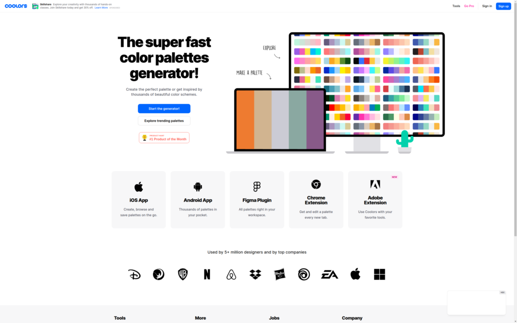
Source: Coolors.co, 2023
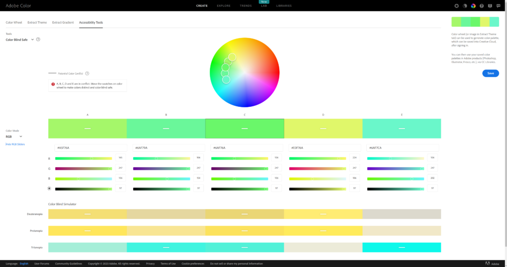
Designing for Colorblindness
Around 300 million people worldwide have some form of color blindness (mostly red-green). This is a significantly large potential customer base who may not be able to see some or most of the elements of your website. The four major forms of red-green colorblindness are:
- Protanopia: Shades of reds are imperceptible and perceived as blacks; colors are seen as shades of blue or gold. Dark brown is confused with dark shades of other colors like red, orange, or green.
- Deuteranopia: Greens are imperceptible; blues and gold are usually seen. Shades of red and green are perceived interchangeably. Yellows and bright shades of green look the same.
- Protanomaly: Red appears as dark gray; all reds are less bright.
- Deuteranomaly: See mostly blues, yellows, and generally muted colors.
Other types include blue-yellow colorblindness, among others. Fortunately, some online tools can help you design safe themes and adjust your color palettes.
Adobe Color’s accessibility tools allow you to drag sliders to get the correct color values. You can also drag and drop your theme onto the website to check your current palette schemes.
Font Pairing Techniques
As taught in many online graphic design degree programs, the four fundamental principles of typography are contrast, space, hierarchy, and size. The main goal is to balance legibility with style in your design. Here are some key ideas for font pairings you can try:
- Play around with light, regular, and bold font weights (same font).
- Combine different font families and typefaces.
- Incorporate kerning or spacing of individual letters in a word, phrase, or sentence.
- Use drop caps wherein the first letter of the main text is huge, often stylized, and open to any design. It is a classic method used in old books.
- Font aesthetics must be balanced with the overall design.
- Make some font areas quirky or look out-of-sorts to convey excitement or novelty, but keep it simple if simplicity is required!
- Incorporate CJK fonts – Chinese, Japanese, and Korean scripts for some flair. Consult a native speaker about the subtle nuances of translations.
- Use secondary typefaces when the primary typeface does not have the desired style or impact. Many modern website designs rely on sans serif fonts for clean, crisp readability across screens.
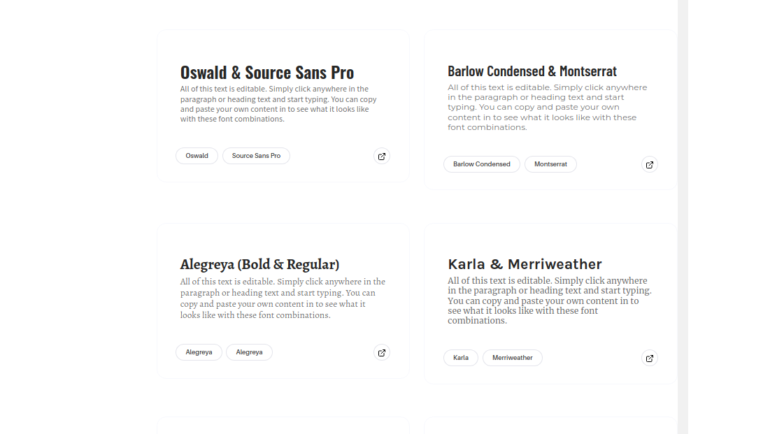
Some examples are as follows:
- Abril Fatface and Poppins
- Alegreya (Bold and Regular)
- Barlow Condensed and Montserrat
- Cormorant Garamond and Proza Libre
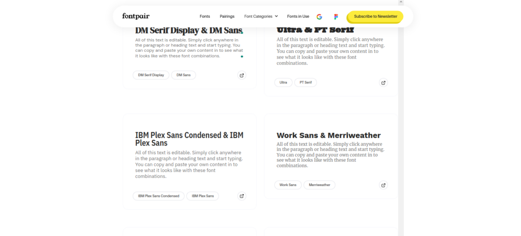
- DM Serif Display and DM Sans
- Epilogue and Anybody, by Etcetera Type Company
- IBM Plex Sans Condensed and IBM Plex Sans
- Karla and Inconsolata
- Karla and Merriweather
- Libre Baskerville (Bold and Regular)
- Libre Baskerville and Source Sans Pro
- Lobster Two and Kaushan Script, by Impallari Type
- Montserrat and Hind
- Nunito and PT Sans
- Nunito Sans (Bold and Regular)
- Oswald and Source Sans Pro
- Oswald and Source Serif Pro
- Playfair Display and Lato
- Playfair Display and Source Sans Pro
- Quattrocento and Lora
- Quattrocento and Quattrocento Sans
- Quicksand (Bold and Regular)
- Roboto Condensed and Roboto
- Stint Ultra Expanded and Pontano Sans
- Ultra and PT Serif
- Work Sans and Merriweather
- Yeseva One and Josefin Sans
Tools for Pairing Fonts
- Google Fonts is a must-see site for general ideas on choosing font pairings. All fonts are open-source and free to use.
- FontPair allows you to see interactive font pairings and any fonts from Googe Fonts, which are free to use.
Develop Your Fonts
Why not just make your fonts? Apple changed from Helvetica Neue to a font they created in-house called San Francisco, which worked well for them. A free online tool is the open-source Birdfont – create and test your fonts!
Color and Font Away!
The above techniques are secondary only to the message and UX. The design depends on feedback and is iterative—with A/B testing on a small sample of users and customers, expect several design changes. Use your imagination and create a way!


